I personally believe that recessions can be forecast in advance. While no indicator is perfect, there are a few processes that have had a high correct signal rate in the past.
The reason that getting in front of recession is important is that it is during recessions that all the bad corrections tend to happen. Bad as in -40% bad.
The other problem with recessions is that they are only known in hindsight. It takes two quarters of negative GDP growth for the chief recession czars at the National Bureau of Economic Research to tell us when the recession actually started.
Following are three of my favorite leading “recession watch” indicator charts:
Chart 1: The Economy (no current sign of recession)
Here is how you read this chart:
- Believe it or not, the stock market is a great leading indicator for the economy. It tends to turn down in advance of recession.
- This process (bottom section of the chart) plots the S&P 500 Index (red line) and also a five-month smoothed moving average of the S&P 500.
- The smoothed dotted line (green in lower section) represents the trend of the market’s prices.
- When the red line (S&P 500 Index) drops below its smoothed moving average trend line (dotted green line) by 4.8% or more, a recession signal is generated.
- When the red line rises above the dotted green line by 3.6% or more, a bullish signal is triggered for the economy.
- The down arrows are the recession signals, up arrows are the expansion signals.
- The gray vertical shaded lines mark the beginning and end of all the recessions since 1948.
- In total, 79% of the signals have been correct though some have been a little early or just a little late. There were a few false signals but they didn’t keep you offsides for long. All in all, in my opinion, pretty darn good.
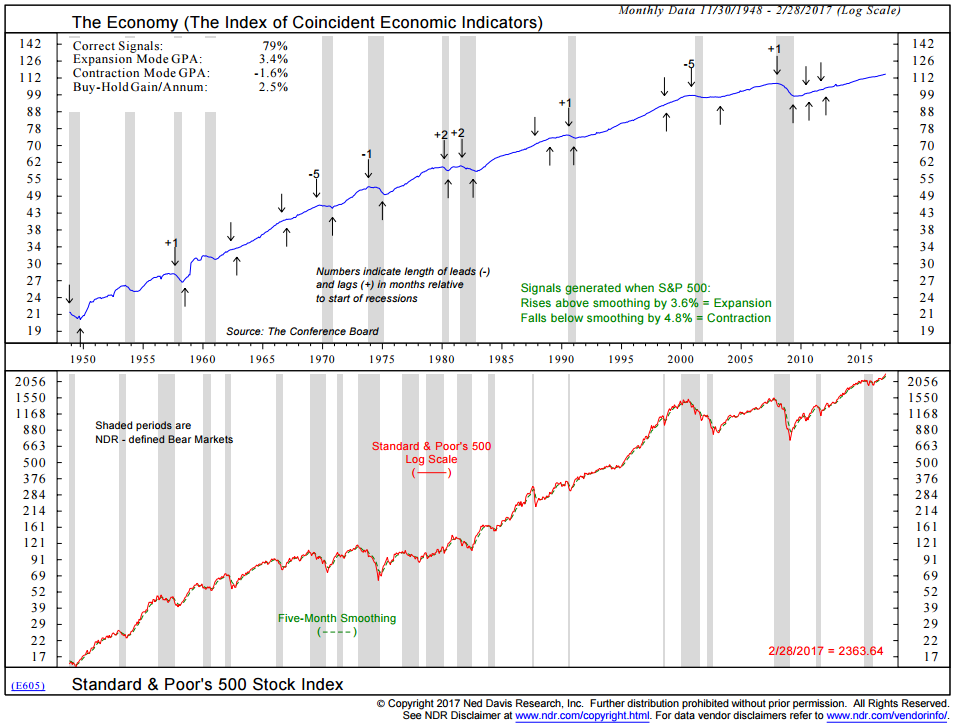
Chart 2: The Economy vs. the Employment Trends Index
Here is how you read the chart:
- 100% correct signals
- Down arrow – recession signal is generated when the Employment Trends Index drops by 4.8% from the most recent high watermark.
- Up arrow – expansion signal is generated when the Employment Trends Index rises from its most recent low watermark by just 0.4%.
- Data 1979 through 2/28/2017
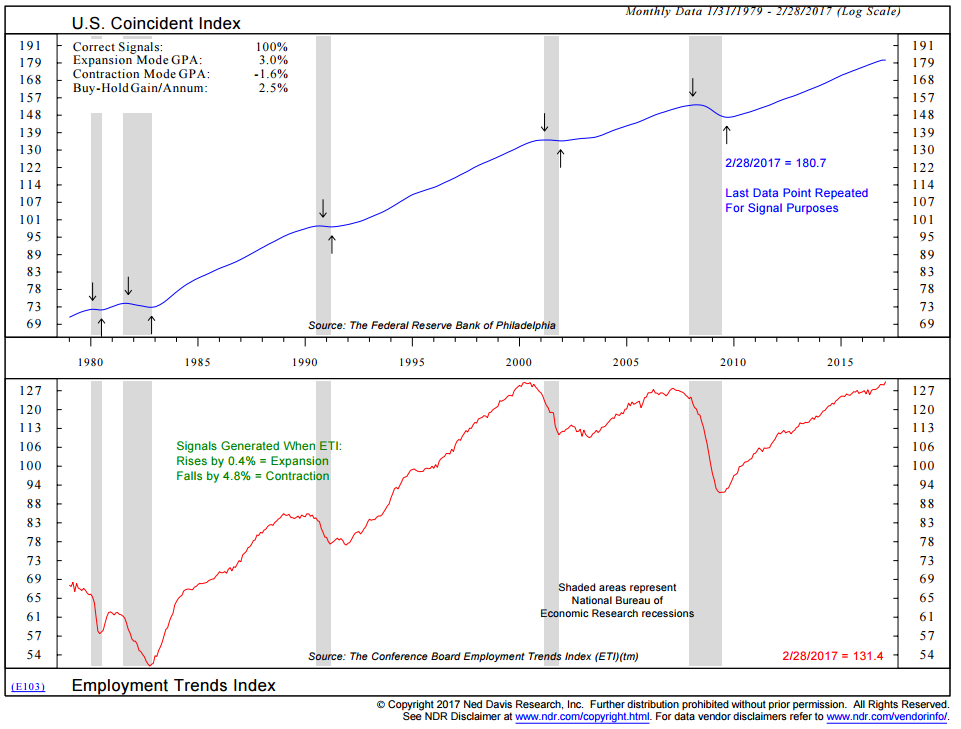
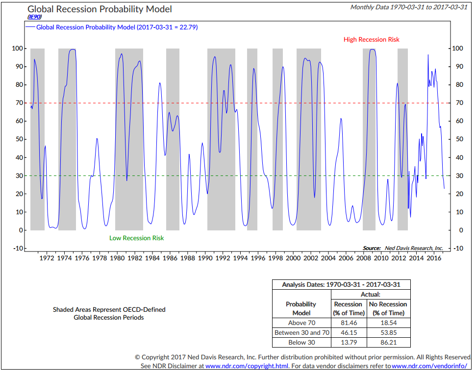
Chart 3: Global Recession Probability Model
Here is how you read the chart:
- High global recession probability when the blue line is above the dotted red line.
- Low global recession probability when the blue line is below the dotted green line (like today).
- The box at the bottom right shows what happened. When above the dotted red line (the 70 level on the chart), recession occurred 81.46% of the time. 54% of the time (including the most recent high recession risk reading in 2016), a recession did not occur. This is a probability game, folks… but pretty good accurate history.
Conclusion: Low current risk of a U.S. recession. Low current risk of a global recession.
