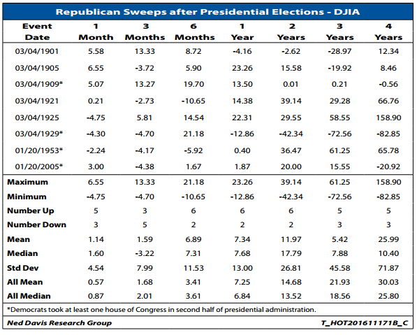
Interesting chart from Ned Davis Research. Most people believe that Republican control is pro-business and thus good for stocks.
Tactical investing news, views and resources for financial advisors
|
Interesting chart from Ned Davis Research. Most people believe that Republican control is pro-business and thus good for stocks.

|
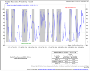 In this week’s On My Radar, we assess global and U.S. recession probabilities. Why? In recessions, equity markets take the most severe hits (think -30%, -40% to -60% or more).
I’m on record saying that the risk of a U.S. recession in 2017 is high. I hold this view due to the quarter-over-quarter decline in corporate earnings and the length of the current business cycle (simply, it is aged). We tend to get one to two recessions every decade. The last was in 2008.
Further, the higher the valuation, the further the equity market will fall when recession strikes. So we keep it on our radar. I share several of my favorite recession prediction indicators in this next section. In short, I see no immediate signs of recession.
READ MORE|
 In my impatient “get to the point” way, I share with you the key points that Ray Dalio shared in a LinkedIn article this past week. It is worth the read.
As you read, look past any particular political view you might hold and think in terms of inputs and outputs. Pull this lever and x will likely happen, pull that lever and y will likely happen.
To this end, we require our interns and research team to read “How the Economic Machine Works.” I also make my young adult children read it… and have gone as far as asking them to share it with their economics teachers.
READ MORE|
Paul Tudor Jones is one of the greatest traders of all time. Jones’ firm, Tudor Investment Corporation, manages about $13 billion across multiple strategies.
Jones says, “The whole trick in investing is: ‘How do I keep from losing everything?’” To which, he said he would advise investors to “to get out of anything that falls below the 200-day moving average.” Visually, it looks something like this:
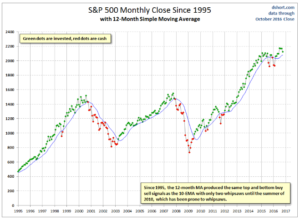
Source: dshort.com.
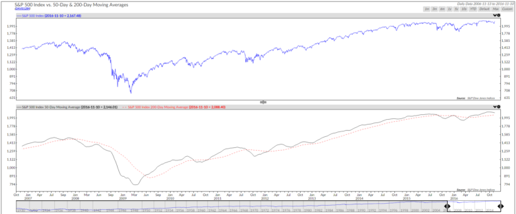
Here’s a trend following idea for you to consider. In the next chart, the black line is the simple 200-day moving average line. The red dotted line is the 50-day shorter-term moving average line. Both are a way of showing us the current price trend. When the 50-day trend line moves above the longer 200-day trend line, the overall trend is bullish. When below, it is bearish.
Since 1929, 65.98% of the time, the market trend was bullish and returns highest. Likewise, the data since 2006 shows similar results. The return figures are the percentage annualized gain per year. The yellow highlight shows the regime we are in today. The trend by this measure is currently bullish.

|
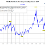 Early each month, we look at market valuations to see where we are. It’s also important to consider what valuations may indicate with respect to probable (7- and 10-year) forward returns. We believe risk is most when we feel it least and the risk is least when we feel it most. Today, we feel it least.
In Friday’s On My Radar, we presented several valuation charts, including median price-to-earnings (P/E) and Warren Buffett’s favorite.
Bottom line: the market remains overvalued. Trend following strategies can help you participate and protect.